What I Learned from My Biggest Web Design Failures
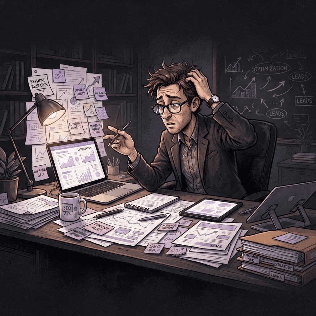
Discover valuable lessons from my biggest web design failures, and learn how to avoid common mistakes to create stunning, user-friendly websites.
Written by Logan
OptiLeads editorial guide · Human-first SEO
Logan writes from the messy middle: the experiments that flopped, the lessons that took too long to learn, and the practical fixes that finally held up.
What I Learned from My Biggest Web Design Failures
What happened, summed up
Once, I thought I could squeeze a high-impact design into a cramped budget without consulting the client effectively. The result? A half-finished website that made my client cringe more than smile. Spoiler: the fix was not about tossing more money at the project. It was about improved communication and setting realistic expectations.
Then it hit me
On a particularly gloomy Wednesday, I presented my “brilliant” design to a client who looked like someone had just stolen their favorite lunch. I kept waiting for the compliments while they fidgeted and glanced at their shoes. That sinking feeling in my stomach told me something was very off. The design might have been sleek, but it felt completely wrong for their brand. Embarrassed, I realized I’d prioritized my vision over their needs, a classic rookie mistake—one I wasn’t eager to repeat.
Illustrative story: The Award-Winning Identity Crisis
About a year ago, I was tasked with redesigning a local bakery's website. They wanted something charming and warm, a digital hug for their pastries. I had just read an article about using minimalist design, so naturally, I thought I could make their colorful, cozy brand fit into tiny, monochrome boxes. The result looked slick, but it felt colder than a day-old croissant.
I didn’t ask enough open-ended questions in our initial meetings. Stubborn me assumed I knew best. When I finally hit “send” on the mockup, I was met with a silent reception and a lot of awkward glances. Instead of the enthusiastic “yes!” I expected, there were crickets.
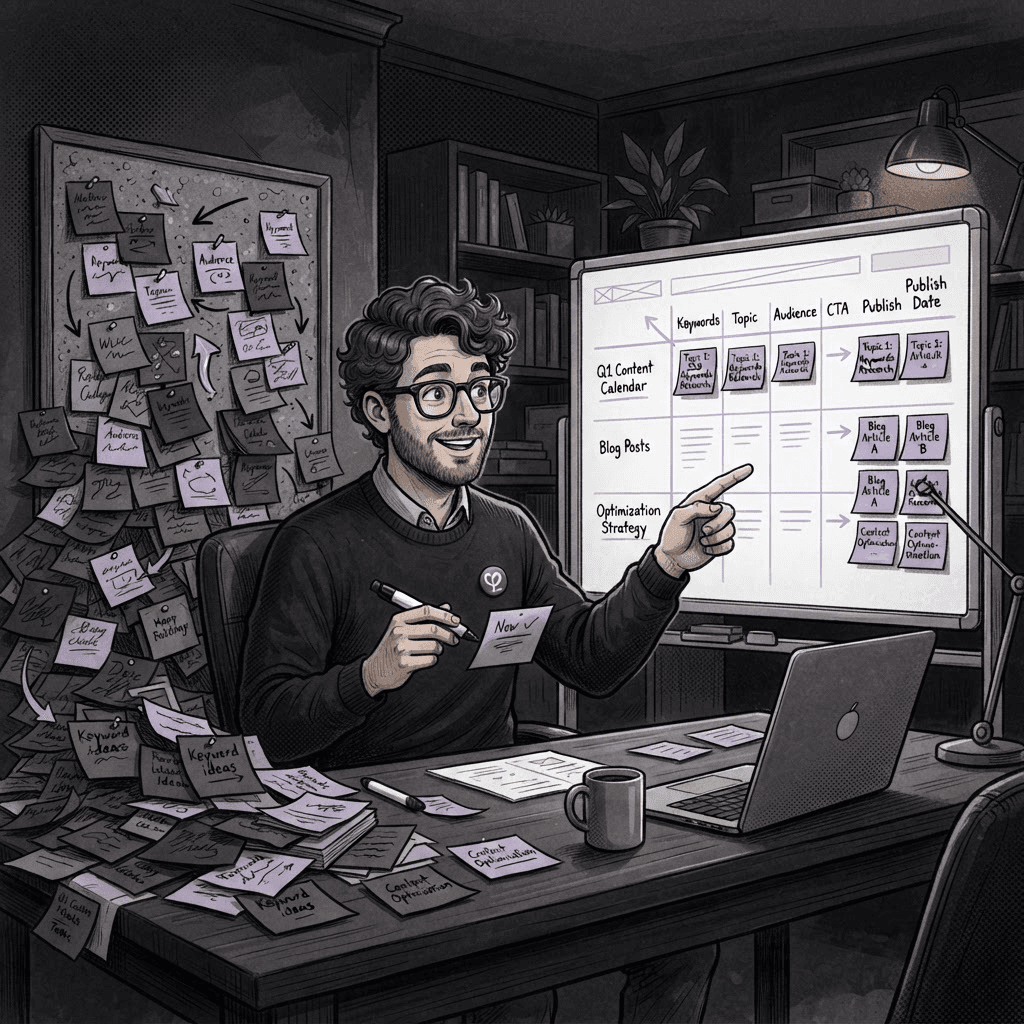
After a long chat, we realized my vision didn’t match their identity at all. So, I pivoted. I scrapped the "clean" aesthetic and, following their lead, infused warmth back into the design—using colors and images that echoed their cozy bakery vibe. By actively listening to their feedback and asking deeper questions, I learned their essence didn’t come from minimalism; it emerged from their love for baked goods and community.
This experience highlighted two major lessons. First, design isn’t a one-size-fits-all. Secondly, understanding a client’s story is far more important than my design heroics. The bakery's final website? It didn't just work: it felt like home.
Concrete next steps for your projects:
- Engage from the start: Ask open-ended questions and keep the conversation flowing. Don’t just tick boxes—dig deeper.
- Iterations over assumptions: Share drafts early and often. Encourage feedback and be ready to adapt.
- Balance vision with reality: Find the sweet spot between your creativity and the client’s needs. Your best project might require some compromise.
Key takeaway: Empathy separates a good designer from a great one. Listen first, design later, and always adjust your artistic ego to fit the client's vision.
FAQs
- How can I improve communication with my clients?
Make it a habit to check in regularly, using video calls or meetings to ensure both parties are aligned and comfortable. - What if a client doesn’t like my design?
Take it as constructive feedback. Ask questions to understand why, rather than getting defensive. There’s always room for improvement.

Tags